
Tyrrell Studio branding
Deprecated: Constant E_STRICT is deprecated in /home/jaja8595/public_html/includes/errors.inc on line 29
Deprecated: Constant E_STRICT is deprecated in /home/jaja8595/public_html/includes/errors.inc on line 29

Tyrrell Studio
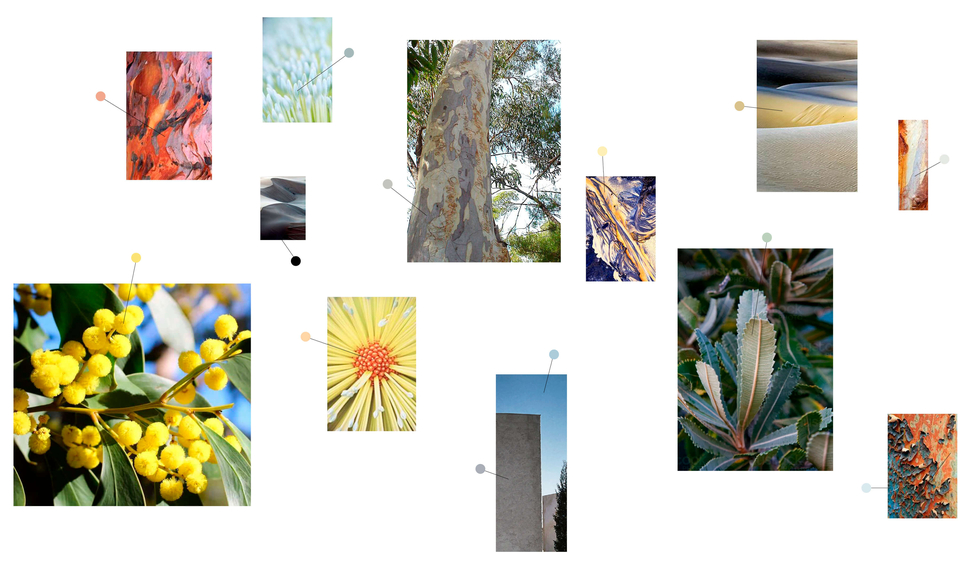
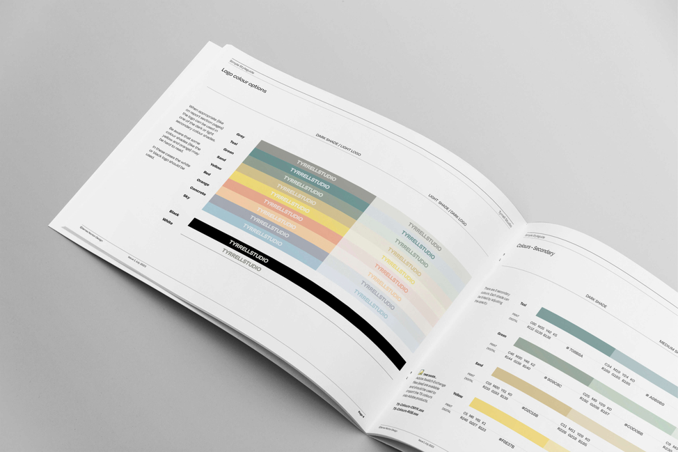
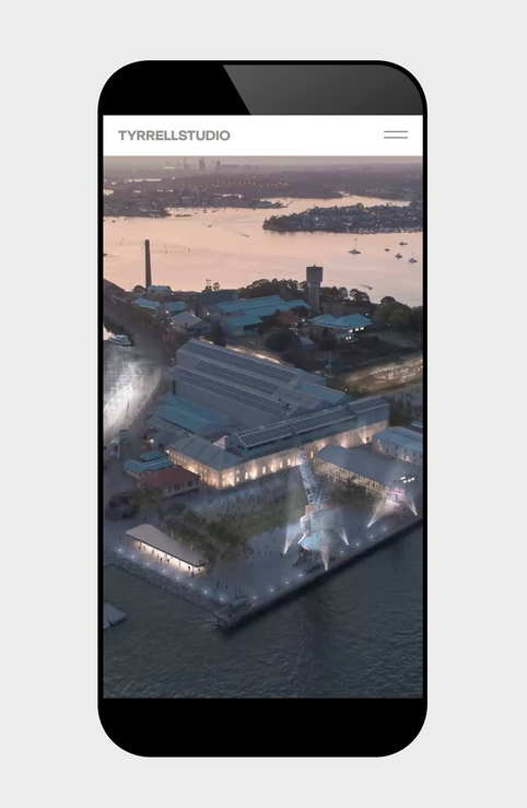
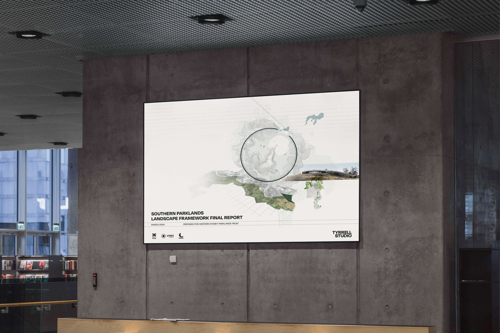
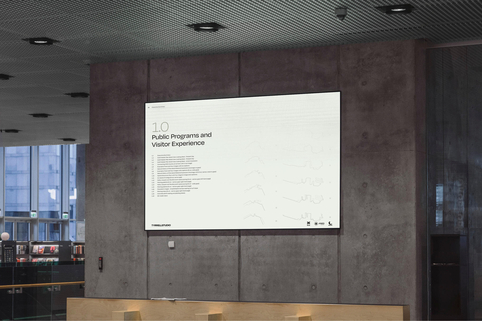
Every now and then you find a client that loves the details as much as you do. After a Tyrrell Studio brand audit in 2019 it was time to revamp the studio’s design identity with a new logo, font, colour palette, website and report template. I love introducing clients to the nuances of choosing the right font. It’s often an eye-opening experience for them. But once we nail it and they see it come to life in real-world applications they get even more excited. Website coding was done by the team at Chris&Co.
See the website.
What we did:
- – Branding
- – Print design
- – Website design
- – Digital documents
- – Styleguide
Deprecated: Constant E_STRICT is deprecated in /home/jaja8595/public_html/includes/errors.inc on line 29
Deprecated: Constant E_STRICT is deprecated in /home/jaja8595/public_html/includes/errors.inc on line 29
Deprecated: Constant E_STRICT is deprecated in /home/jaja8595/public_html/includes/errors.inc on line 29
Deprecated: Constant E_STRICT is deprecated in /home/jaja8595/public_html/includes/errors.inc on line 29

Deprecated: Constant E_STRICT is deprecated in /home/jaja8595/public_html/includes/errors.inc on line 29
Deprecated: Constant E_STRICT is deprecated in /home/jaja8595/public_html/includes/errors.inc on line 29
Deprecated: Constant E_STRICT is deprecated in /home/jaja8595/public_html/includes/errors.inc on line 29
Deprecated: Constant E_STRICT is deprecated in /home/jaja8595/public_html/includes/errors.inc on line 29

Deprecated: Constant E_STRICT is deprecated in /home/jaja8595/public_html/includes/errors.inc on line 29
Deprecated: Constant E_STRICT is deprecated in /home/jaja8595/public_html/includes/errors.inc on line 29
Deprecated: Constant E_STRICT is deprecated in /home/jaja8595/public_html/includes/errors.inc on line 29
Deprecated: Constant E_STRICT is deprecated in /home/jaja8595/public_html/includes/errors.inc on line 29

Deprecated: Constant E_STRICT is deprecated in /home/jaja8595/public_html/includes/errors.inc on line 29
Deprecated: Constant E_STRICT is deprecated in /home/jaja8595/public_html/includes/errors.inc on line 29
Deprecated: Constant E_STRICT is deprecated in /home/jaja8595/public_html/includes/errors.inc on line 29
Deprecated: Constant E_STRICT is deprecated in /home/jaja8595/public_html/includes/errors.inc on line 29
Deprecated: Constant E_STRICT is deprecated in /home/jaja8595/public_html/includes/errors.inc on line 29
Deprecated: Constant E_STRICT is deprecated in /home/jaja8595/public_html/includes/errors.inc on line 29
Deprecated: Constant E_STRICT is deprecated in /home/jaja8595/public_html/includes/errors.inc on line 29
Deprecated: Constant E_STRICT is deprecated in /home/jaja8595/public_html/includes/errors.inc on line 29
Deprecated: Constant E_STRICT is deprecated in /home/jaja8595/public_html/includes/errors.inc on line 29
Deprecated: Constant E_STRICT is deprecated in /home/jaja8595/public_html/includes/errors.inc on line 29
Deprecated: Constant E_STRICT is deprecated in /home/jaja8595/public_html/includes/errors.inc on line 29
Deprecated: Constant E_STRICT is deprecated in /home/jaja8595/public_html/includes/errors.inc on line 29

Deprecated: Constant E_STRICT is deprecated in /home/jaja8595/public_html/includes/errors.inc on line 29
Deprecated: Constant E_STRICT is deprecated in /home/jaja8595/public_html/includes/errors.inc on line 29
Deprecated: Constant E_STRICT is deprecated in /home/jaja8595/public_html/includes/errors.inc on line 29
Deprecated: Constant E_STRICT is deprecated in /home/jaja8595/public_html/includes/errors.inc on line 29
Deprecated: Constant E_STRICT is deprecated in /home/jaja8595/public_html/includes/errors.inc on line 29
Deprecated: Constant E_STRICT is deprecated in /home/jaja8595/public_html/includes/errors.inc on line 29
Deprecated: Constant E_STRICT is deprecated in /home/jaja8595/public_html/includes/errors.inc on line 29
Deprecated: Constant E_STRICT is deprecated in /home/jaja8595/public_html/includes/errors.inc on line 29

Deprecated: Constant E_STRICT is deprecated in /home/jaja8595/public_html/includes/errors.inc on line 29
Deprecated: Constant E_STRICT is deprecated in /home/jaja8595/public_html/includes/errors.inc on line 29
Deprecated: Constant E_STRICT is deprecated in /home/jaja8595/public_html/includes/errors.inc on line 29
Deprecated: Constant E_STRICT is deprecated in /home/jaja8595/public_html/includes/errors.inc on line 29

Deprecated: Constant E_STRICT is deprecated in /home/jaja8595/public_html/includes/errors.inc on line 29
Deprecated: Constant E_STRICT is deprecated in /home/jaja8595/public_html/includes/errors.inc on line 29
Deprecated: Constant E_STRICT is deprecated in /home/jaja8595/public_html/includes/errors.inc on line 29
Deprecated: Constant E_STRICT is deprecated in /home/jaja8595/public_html/includes/errors.inc on line 29

Deprecated: Constant E_STRICT is deprecated in /home/jaja8595/public_html/includes/errors.inc on line 29
Deprecated: Constant E_STRICT is deprecated in /home/jaja8595/public_html/includes/errors.inc on line 29
Deprecated: Constant E_STRICT is deprecated in /home/jaja8595/public_html/includes/errors.inc on line 29
Deprecated: Constant E_STRICT is deprecated in /home/jaja8595/public_html/includes/errors.inc on line 29
Deprecated: Constant E_STRICT is deprecated in /home/jaja8595/public_html/includes/errors.inc on line 29
Deprecated: Constant E_STRICT is deprecated in /home/jaja8595/public_html/includes/errors.inc on line 29
Deprecated: Constant E_STRICT is deprecated in /home/jaja8595/public_html/includes/errors.inc on line 29
Deprecated: Constant E_STRICT is deprecated in /home/jaja8595/public_html/includes/errors.inc on line 29
Deprecated: Constant E_STRICT is deprecated in /home/jaja8595/public_html/includes/errors.inc on line 29
Deprecated: Constant E_STRICT is deprecated in /home/jaja8595/public_html/includes/errors.inc on line 29
Deprecated: Constant E_STRICT is deprecated in /home/jaja8595/public_html/includes/errors.inc on line 29
Deprecated: Constant E_STRICT is deprecated in /home/jaja8595/public_html/includes/errors.inc on line 29
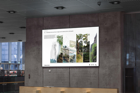
James delivered a brand and website that feels like it expresses more than what we do, but who we are.
Designers working with designers can lead to difficulties… James stuck with us through all our changes of mind and mood and nailed a brand, colour themes and website design for us that expresses who we are and what our work means to us. James took us on a journey through colour palettes, font styles, layouts and themes, always developing an idea that little bit further to ensure it was truly unique. He was generous with his time and communicated clearly with us throughout the process. James was always accommodating of our ideas and right to the end of the process was attentive to any ‘last minute requests’… of which there were a few. I would recommend JND to anyone who needs a professional yet highly bespoke branding suite.

